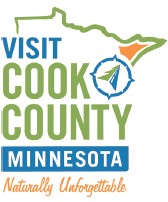
These are exciting times in Cook County! Summer has arrived, tourism is booming and Visit Cook County recently refreshed their company brand. The updated logo and tagline were designed to better identify where Cook County is located in Minnesota as well as capture the feeling locals and tourists say they experience by living and playing in this marvelous part of the world.
To begin the rebranding process, Visit Cook County sent out an electronic survey to residents and tourists asking them to share what it is that makes Cook County unique in their hearts and minds. The research showed there are millions of different reasons why people visit Cook County in the first place but once they do, they are hooked. The research also proved that explaining where Cook County is located in Minnesota is not an easy task. Statements such as: “Along the North Shore of Lake Superior,” or, “In the northeastern corner of the state of Minnesota,” and “Inside Minnesota’s Arrowhead,” while accurate, were difficult to incorporate into a statement that needed to be directional, inspirational and short.
The decision was made to update the Visit Cook County logo with a green and blue color palette representing Cook County’s strong ties to nature, Lake Superior and the Boundary Waters. An energetic orange was added to the color palette to clearly identify where Cook County is located in Minnesota. Also, the tagline “Naturally Unforgettable” was chosen to solidify Cook County’s position as a place that naturally leaves an impression on people and keeps them coming back all their lives.
How to determine when to rebrand
With the launch of the Visit Cook County rebrand, now is a good time to take a look at your company’s brand and determine if there is a way you could be making a more powerful and meaningful statement to your prospects.
There are five key elements that make up a brand. Every company has these elements whether they were intentionally chosen or not. The key to success is to ensure you have carefully considered each one of these elements and designed them to leave prospects with the right impression.
Visual components of a brand
. Company name—it goes without saying a company name is an important part of a brand. After all, it is what people will most commonly refer to you by.
. Logo—a logo is an art element used to help better differentiate one company from another. A logo is often used to enhance a company name, or better identify what a company offers. A strong logo will also incorporate brand colors and typography that accurately represent the personality of the organization.
. Tagline—a tagline or positioning statement is commonly used along with a logo to better identify what makes a company unique. Strong taglines are unique, clever and short.
Emotional components of a brand
. Brand values—brand values radiate from the core of your business and should drive the visual elements of your brand. Defining 3 – 5 key values your company stands for is the key to long-term business success.
. Brand personality—just like people, companies have personalities as well. Take time to design the personality you want your company to have in order to better relate to your prospects.
The most important key to branding success is to ensure every person who works for your organization understands your brand values, expresses your brand personality, and clearly understands what it is that separates your company from your peers and competition. By taking time to clearly define these brand elements, your company may become “Naturally Unforgettable” in the hearts and minds of your prospects as well.
Pascha Apter, CEO of Giant Voices, Inc., provided this month’s look at tourism in Cook County.


Leave a Reply